Starbucks Marketing Campaign
May 2, 2010
As part of my Marketing unit at Bournemouth University I was required to carry out an analysis of Starbucks in the UK to evaluate the state of business at present and make recommendations on how to improve sales and increase growth throughout the UK.
On the assumption that the technicalities of my business report may be fairly weak – business was never my strong point – I concluded that adding some creativity into my recommendations may make up for my lack of economical knowledge. As a result I sketched 8 new ideas for carry-out cups that Starbucks could hypothetically introduce to their UK stores for consumers to choose from. After analysing (albeit probably not very well) that Starbucks had lost their fashionable edge and the exclusiveness that the brand once stood for, I wanted my designs to reincoporporate the element of fashion into drinking coffee and attracting a younger demographic. Below are my 8 ideas for new cups, drawn with coloured artist pencils and black pen which were then scanned into the computer so that each slogan could be added.
‘The Original’

My first sketch was simply a cup that held the original design that has been a part of Starbucks since it first began. It seemed imperitive to me to keep this design to appeal for the members of the market who were happy with Starbucks just the way it was.
‘The Green One’

This design was created on the basis that Starbucks need to regain an edge over competitors on the ‘Fair Trade’ side of things. As Fair Trade becomes more and more common throughout the world, companies are required to make an effort to show that their business has ethical grounds. This cup would also allow the consumer to feel like they are doing a good deed, and a green and brown colour scheme was used to tie in with the environmentally friendly side to this choice.
‘The Classic’

‘The Classic’ used a blend of the trademark colours that are associated with Starbucks to create a new and sophisticated carry-out cup for consumers to choose from. The prominence of the dark green gives this choice an elegant edge. It was also recommended in the report that Starbucks used subtle celebrity-endorsement, with the idea that if certain celebs were ‘papparazzied’ holding the cup of their choice, their fans would follow suit. This cup would look good in the hands of a male, sophisticated actor, suggesting a fashionable twist to the already cemented colours of Starbucks.
‘The Striped One’

Following the idea of celebrity-endorsement, the idea was proposed that the minute a female celebrity known for having immense fashion sense, such as Cheryl Cole or Kate Moss stepped out wearing an outfit that matched this carry-out cup, everyone would want one. The nautical theme makes this choice an excellent one for summer and really brings the fashion element back into the coffee drinking experience.
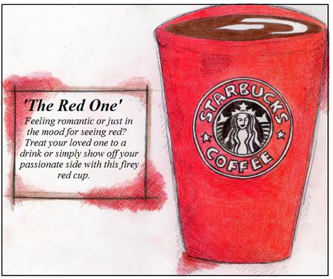
‘The Red One’

This red cup was supposed to bring a romantic feel to the choice available to consumers. As a passionate colour this cup would be easy to market in terms of romance and love, and would appeal to younger consumers who are dating but are unable to go to pubs or bars. As a single, bold colour it also offers the chance to make a fashion statement with your cup of coffee.
‘The Leopard Print One’

This design was the quirkiest of the lot and really relies on consumers expectations of a sense of fashion and exclusiveness from the coffee drinking experience. Being marketed as a ‘wild’ design also enabled this idea to mention the effort they put in to sourcing the best coffee beans from around the world.
‘The Black One’

This simple sketch shows another idea that is meant to ooze elegance, and the colour black hopefully would appeal to a male demographic as much as a female one.
‘The Cosy One’

This design was my ultimate favourite of the 8, based on the classic print of pyjamas this cup gives consumers the choice of a relaxed, chilled out drink in or out of the Starbucks restaurants.
Overall I was proud of my designs for the new Starbucks range of cups. Knowing that the business element to my report perhaps wasn’t as strong as I had hoped, I at least wasn’t ashamed at my efforts to draw my ideas. Personally, I’d definitely visit Starbucks more often if their cups looked like this! But then, I am a lover of the coffee shop chain anyway, and also, I am biased…

